


The Timeless Edit
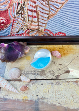
Poole Pottery Twintone Winkle Shell Vase C104, Sky Blue and Dove Grey, 1960s, Made in England
A little piece of Dorset coastline in ceramic form, this sculptural Poole Pottery Winkle Shell brings a vivid flash of turquoise-blue to an otherwise quiet shelf. The soft dove-grey exterior lets the shell ridges do the talking, while the saturated interior comes alive when viewed from above.
The Winkle Shell shape was originally developed by Poole designer John Adams in the late 1930s. This example belongs to the later Twintone period, in the C104 Sky Blue and Dove Grey colourway associated with Poole's mid-century production. It is a beautiful object for a mantelpiece, bedside table or collected shelf, and could be used as a small trinket dish, a low posy vessel or simply displayed for its form.
Poole Pottery's marine-inspired designs feel especially at home in an Australian interior, where the language of shells, water and weathered colour never feels out of place. The impressed and printed Poole England mark, together with the incised C104 code, gives this small piece its useful collector detail.
Details
- Maker: Poole Pottery
- Origin: Poole, Dorset, England
- Designer: John Adams, original shell form
- Range: Twintone
- Shape: Winkle Shell
- Colour code: C104
- Colourway: Sky Blue and Dove Grey
- Era: Likely 1960s
- Material: Glazed vitreous earthenware
- Dimensions: 8.5 cm high × 13.5 cm long × 10 cm wide
- Weight: 196 g
- Backstamp: Poole England with incised C104 code
Condition
Excellent vintage condition. No chips or cracks noted. There is one small pinhole in the ceramic body near the shell end, clearly shown in the photographs. The sculptural shell form, glaze and integrated ceramic feet remain intact.
The photographs form part of the condition report — please review all images carefully before purchasing.
Care
Dust or wipe gently with a soft cloth. If used as a small posy vessel, avoid prolonged soaking and dry the interior thoroughly after use. Do not use abrasive cleaners or place in the dishwasher.
Every piece is carefully wrapped and packaged to ensure it arrives at your doorstep in perfect condition.
Age of an Item
Antique: An item that is at least 100 years old.
Vintage: An item that is at least 20 years old but less than 100 years old and is representative of its era.
Retro: A newer item designed in the style of a past era. It is not from that era but is a modern homage to it.
Condition of an Item
Mint: As new, with no signs of wear.
Excellent Vintage Condition (EVC): Shows minimal signs of wear through use but is not perfect.
Very Good Vintage Condition (VGVC): Shows some signs of age and use but is still in good overall shape.
Good Vintage Condition (GVC): Shows clear signs of wear, use, and age.
Perfectly Imperfect: This is not an official term. We've adopted it for the purposes of The Timeless Edit because we believe damaged items still have value. Our definition of Perfectly Imperfect is an item that has visible damage but remains beautiful as a decorative piece or suitable for use in a different capacity from that for which it was originally designed.
Common Flaws Found in Antique and Vintage Items
Air Bubbles: Air bubbles in hand-blown glass are a natural result of the traditional glassmaking process, where air becomes trapped in the molten glass during its creation. They are often seen as a sign of authenticity, indicating the item is handmade and unique, rather than a defect. While a small number of bubbles is generally acceptable, a high concentration of bubbles may indicate fragility. In some cases, air bubbles are an intentional decorative feature. Air bubbles are also found in Depression Glass due to its mass production method, where glass was quickly moulded with little concern for perfection — these bubbles are a common characteristic that signifies authentic pieces.
Bottom Wear: Common in older items, especially glass, and often an indication of age. Wear to the base of an item is caused by everyday use over time and includes scratches, scuffs, shallow chips, flakes, and flea bites.
Chip: Chips are considered either shallow or deep. A shallow chip is typically inconspicuous. A deep chip is large enough to be immediately apparent.
Crazing: Crazing is a web of fine cracks that occurs only in the glaze layer of fine bone china and porcelain. It is a normal occurrence, particularly in older items.
- Clean Crazing: The cracks are clear, without any staining from food, moisture, or other contaminants. Clean crazing can be used as an intentional decorative design element.
- Stained Crazing: This occurs when food particles, bacteria, or other contaminants get into the cracks over time, causing them to darken and become visually conspicuous. Items with stained crazing are not recommended for use with food but are still suitable as decorative pieces.
Firing Flaw: An original flaw caused during the firing process. Examples include pinholes or blisters in the glaze, grit stuck to the glaze, stains caused by an impurity in the porcelain, and shrinkage cracks that have opened during the drying or firing process. This is not considered damage.
Flake: A small and shallow chip which breaks the surface of an item.
Flea Bite: A tiny, pin-sized chip or nick in the surface of an item. It is a common form of imperfection in older items, especially glass.
Hairline Crack: A narrow and tight break going through the glaze and porcelain body, visible from both sides of the item. It is not always immediately obvious and can be missed on first inspection. Generally, a hairline crack does not affect the integrity of the item.
Maker's Miss: An unintentional inclusion or air bubble in the item caused or overlooked by the glassblower or maker during the manufacturing process.
Scratch: A mark which compromises the surface of an item and which feels raised, rough, or sharp to the touch. Not to be confused with Straw Marks and marks which can occur during the manufacturing process.
Straw Marks: Marks on the external surface of glass that look like fine lines or even scratches. They occur when molten glass is cut with shears and the resulting mark doesn't fully smooth out before the glass cools and sets. They are not considered damage but are instead a common characteristic of old, handmade, or machine-pressed glass. Unlike a scratch, straw marks feel smooth to the touch. Straw marks are commonly found in Depression and Carnival Glass.
Water Mark / Stain: Patches, ridges, deposits, and clouding on glass caused by water left standing in the vessel for a lengthy period. Such stains cannot be removed.
Materials and Techniques
Backstamp: The maker's mark printed or impressed on the base of a ceramic or glass item. Backstamps typically include the manufacturer's name, country of origin, pattern name, and sometimes a date code. They are the primary tool for authenticating and dating vintage pieces, and their design often evolved over a maker's history, allowing collectors to pinpoint when a piece was produced.
Bone China: A type of porcelain developed in England in the late eighteenth century, distinguished by the inclusion of bone ash (calcined animal bone) in the clay body. Bone ash gives bone china its characteristic creamy translucency, warmth, and exceptional strength relative to its delicacy. When held to the light, genuine bone china glows. It is the material of choice for the great English china makers — Royal Albert, Royal Doulton, Shelley, Coalport, and many others.
Gilding / Gold Trim: The application of gold to the surface of ceramic or glass as a decorative finish. On vintage pieces, gilding was typically applied using real gold — most commonly 22-carat gold — either by hand or by transfer, then fired to fuse it permanently to the surface. The quality and condition of gilding is an important factor in assessing a piece; worn or rubbed gilding is a common sign of heavy use.
Hand-painted vs Transfer Print: Hand-painted decoration is applied directly to the ceramic surface by an artist, making each piece subtly unique. Transfer printing involves applying a pre-printed design to the surface, allowing for consistent, repeatable patterns at scale. Many pieces combine both techniques — a transfer-printed ground with hand-painted highlights or gilding added over the top. Both methods are found across the great ceramics houses and each has its own collectible appeal.
Iridescence / Carnival Glass: An iridescent surface effect on glass, achieved by spraying metallic salts onto the surface of hot glass before it cools. The result is a lustrous, rainbow-like sheen that shifts colour in different lights. Carnival Glass — so named because it was commonly given as prizes at fairgrounds in the early twentieth century — is the most widely collected form of iridescent glass, produced in the United States, England, and Australia from around 1908 onwards.
Opalescent Glass: Glass that appears milky or translucent white in direct light but takes on a blue or lavender glow when backlit. The effect is achieved by adding bone ash or other opacifying agents to the glass batch. Opalescent glass is closely associated with the Art Nouveau movement and is a signature technique of René Lalique, whose pieces are among the most sought-after examples of the form.
Porcelain: A ceramic material fired at very high temperatures, resulting in a hard, dense, non-porous body. Unlike bone china, traditional porcelain does not contain bone ash. Hard-paste porcelain — the original European formula, developed in the early eighteenth century — is the material of Meissen, Sèvres, and Royal Copenhagen. Soft-paste porcelain, an earlier European approximation, has a slightly different texture and translucency. Both are distinct from bone china, though all three are commonly referred to as "china" in everyday use.
Poole Pottery was born on the edge of a harbour in Dorset, and it has never quite lost that quality — something grounded, coastal, unhurried. Not the grandeur of Wedgwood or the delicacy of Royal Albert, but something more quietly confident: a pottery that knew its own mind and made things accordingly.
The story begins not with the name you know, but with a partnership: Carter, Stabler & Adams, founded in Poole, Dorset in 1921. The three principals — Harold Carter, Harold Stabler, and Charles Adams — brought together a tile manufacturer's infrastructure, a sculptor's eye, and a businessman's instinct. What they built, on the edge of Poole Harbour, became one of the most distinctive potteries in twentieth-century Britain.
John Adams and the Design Language of Poole
The visual identity of early Poole pottery owes much to John Adams, the pottery's chief designer from the 1920s through to the 1950s. Adams trained at the Royal College of Art and brought a rigorous, modernist sensibility to what might otherwise have been a regional craft operation. Under his direction, Poole developed its signature approach: hand-painted decoration applied by a team of skilled paintresses, each piece individual, each one signed on the base with the paintress's personal mark alongside the factory stamp.
This is worth understanding if you're buying Poole: the decoration on a piece from this era was not printed or transferred. It was painted by hand, by a named person, in a Dorset factory, decades ago. That's not a marketing claim — it's visible in the slight variations between pieces, the confidence of the brushwork, the way the colour sits in the glaze.
The Twintone Era
In the 1950s, Poole pivoted. The hand-painted floral tradition gave way to something cleaner, more in step with the postwar appetite for simplicity and colour. The Twintone range — introduced in 1956 — paired two complementary colours on a single piece: one for the interior, one for the exterior. Seagull and Ice Green. Peach Bloom and Mushroom. Tweed and Magnolia.
It sounds simple because it is simple. That's the point. Twintone captured the optimism of mid-century domestic life — the sense that a well-designed, well-made object in the right colour could make an ordinary kitchen feel considered. It sold in enormous quantities and is now one of the most collected Poole ranges, particularly in Australia where the palette translates beautifully to our light.
The Shape C97 Conch Shell
Among the most recognisable Poole forms is the Shape C97 — a conch shell vase, produced from the 1950s onward. It's the piece that turns up most often in Australian op shops and estate sales, usually in a Twintone colourway, occasionally in the earlier hand-painted tradition. The form is elegant without being fussy: a naturalistic shell shape that sits comfortably in both a mid-century modern interior and a more eclectic, layered home. If you find one in good condition, it's worth keeping.
Reading the Backstamp: How to Date Your Piece
The backstamp is your best tool for dating Poole pottery, and the key transition to know is this: pieces marked with the blue "POOLE England" stamp — without the Carter, Stabler & Adams name — date from after the pottery was formally renamed Poole Pottery Ltd in 1963. Earlier pieces will carry the CSA mark, sometimes alongside "Carter Stabler Adams" in full.
A blue "POOLE England" stamp tells you you're looking at something from the 1960s onward — the Twintone era and beyond. The CSA marks indicate the earlier, often more collectable, hand-painted period. Neither is better than the other; they're just different chapters of the same story.
From Art Deco to Mid-Century Modern
What makes Poole interesting as a collecting category is that it spans two of the twentieth century's great design movements. The early Carter, Stabler & Adams pieces — with their stylised flora, their bold geometric borders, their rich earthenware bodies — are firmly Art Deco in sensibility. The postwar Twintone and freeform ranges are equally firmly Mid-Century Modern: clean, optimistic, functional.
A collection of Poole pottery can tell the story of British design across forty years. That's not something you can say about many potteries.
An Australian Note
Poole pottery arrived in Australia through the usual channels — department stores, gift shops, the luggage of returning travellers — and has been quietly accumulating in Australian homes ever since. It turns up regularly at estate sales and in op shops, often unrecognised, occasionally underpriced. The Twintone palette in particular — those soft, chalky mid-century colours — suits Australian interiors in a way that feels almost deliberate.
If you find a piece and you're not sure what you have, the backstamp is your starting point. From there, the form and the colourway will usually tell you the rest of the story.


